6.3%
Slots Booked
3%
Activity rate
6%
Av. time on page
6.1%
Registrations

Most customers never finished booking. I redesigned the flow

  • Client
    Bikebook
  • Role
    Lead UX Designer
  • Tools used
    Figma
    Datadog
    Claude
  • Responsibilities:
    Research
    UX and UI design
    Prototyping
    UX copy
    Design system
    Stakeholder management
    Prioritisation
    Developer handoff

Summary

Bikebook’s booking widget sits on partner websites, so it is often a customer’s first contact with the company. Before the redesign, fewer than 5 in every 100 people who started a booking on one retail partner’s widget reached the final step. I redesigned the flow around funnel data, session replays and partner interviews, and kept the interface neutral enough for each partner to make it their own.

I prototyped the design and reviewed it with partners and engineers at every stage. It was not built before I left in August 2026, so this case study sets out the evidence and reasoning behind each decision, not post-launch results.
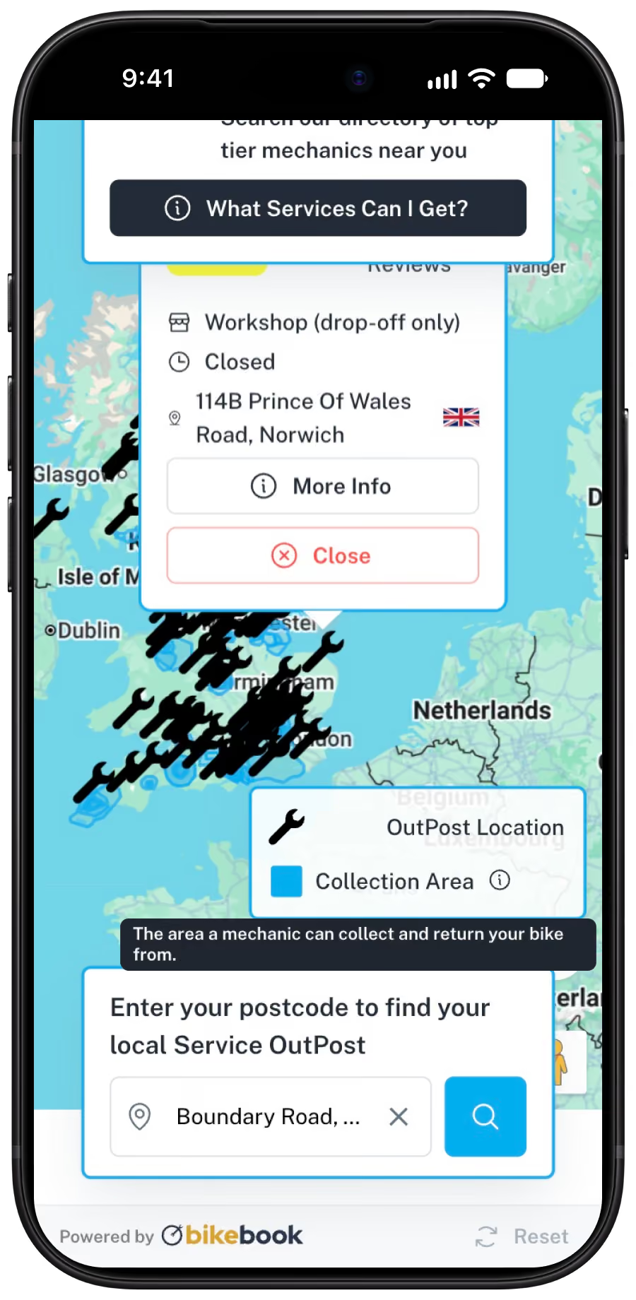
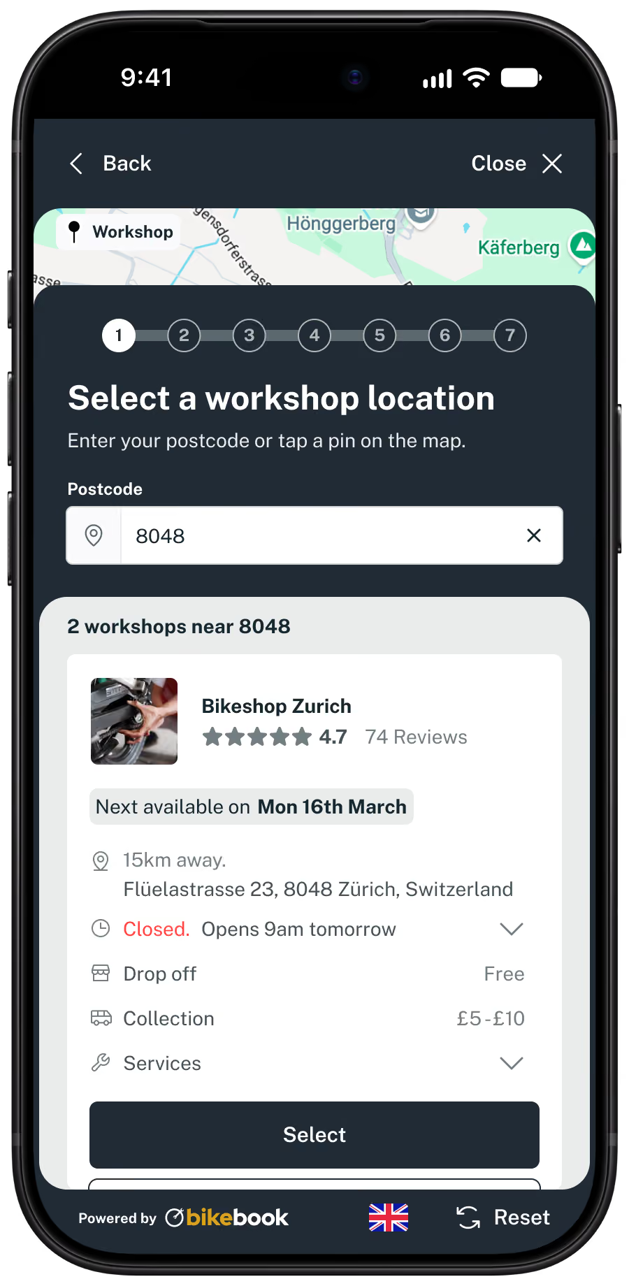
Old vs new

Mobile screen showing a map of the UK and nearby regions with multiple mechanic service points marked. A pop-up panel shows a closed workshop located at 114B Prince Of Wales Road, Norwich, with options for more info or to close the panel. Below the map, a prompt asks to enter a postcode to find a local Service OutPost with a search bar containing an example entry 'Boundary Road'. A legend indicates blue squares mark collection areas where mechanics collect and return bikes. The screen includes branding for bikebook.
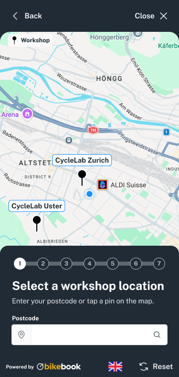
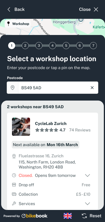
Mobile app screen showing workshop location selection with postcode 8048 entered, listing Bikeshop Zurich 15km away, rated 4.7 stars with 74 reviews, closed and reopening at 9am tomorrow; options include drop off free and collection costing £5-£10, with a select button below.

The problem

Google Analytics 4 data from one partner’s embed in March 2026, before the redesign, shows where people left the booking flow. Step 1 lost the most people, and step 4 was the worst of the later steps.

1. Postcode search (nearest mechanic)

83%
Drop-off
A down arrow icon conveying low user engagement.

2. Select a date

19%
Drop-off
A down arrow icon conveying low user engagement.

3. Select bike and services

17%
Drop-off
A down arrow icon conveying low user engagement.

4. Your information

52%
Drop-off
A down arrow icon conveying low user engagement.

5. Review

11%
Drop-off
A down arrow icon conveying low user engagement.

6. Confirm booking

Final
Drop-off

Partner feedback

I spoke to four bike businesses and a Japanese knife retailer about how the widget could be improved.
Too many steps, and customers want to know which step they are on.
Can we capture customer details as soon as possible?
Customers are not sure which bike they have. Adding a bike is complicated, and the bike name is confusing.
No customer puts a serial number in.
Make it shorter. show only required fields.
Put estimated pricing on booking confirmation page.
Tell customers how long it takes.
Can we customise the text?
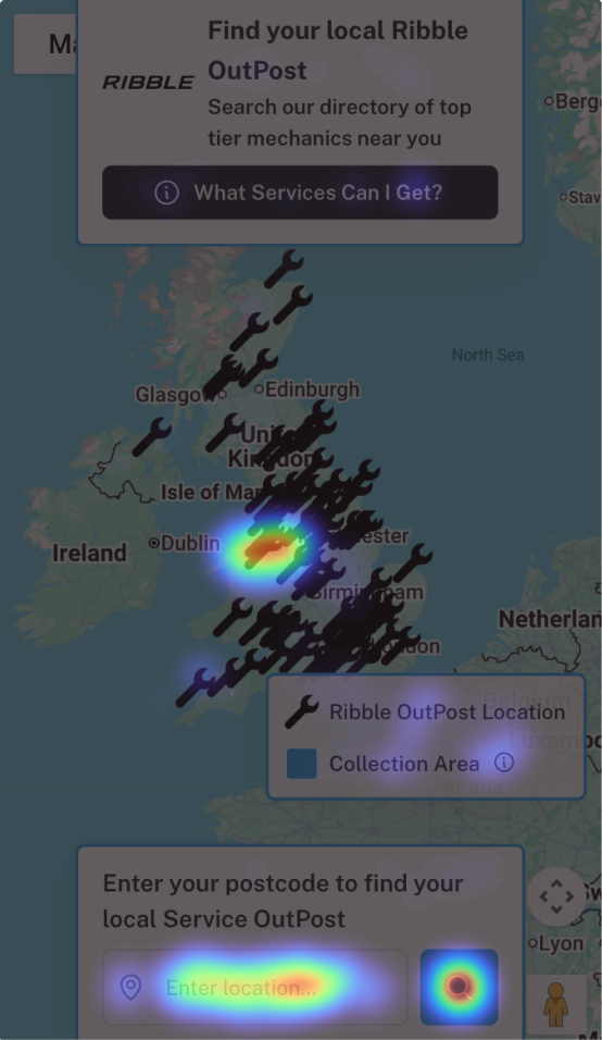
Heatmap over map of the United Kingdom and Ireland showing concentrated Ribble OutPost locations around Birmingham and northern England with black wrench icons scattered across the region. Boxes on the map display a search prompt to find local Ribble OutPost mechanics, an input to enter postcode, and a legend indicating wrench icons for Ribble OutPost locations and a blue square for collection areas.
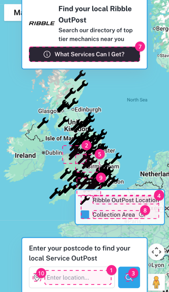
Interactive map of the UK and Ireland showing multiple wrench icons marking Ribble OutPost service locations with clusters numbered 2, 5, and 9. Top panel prompts users to find their local Ribble OutPost and search for top-tier mechanics nearby with a 'What Services Can I Get?' button. Bottom panel invites entering a postcode to find a local Service OutPost with an input box and search button. A legend indicates wrench icons represent Ribble OutPost locations and shaded areas are collection areas.

Research

I did all of the research myself: funnel analysis, session replays and heatmaps, a screen-by-screen audit of the existing flow, partner interviews, a visit to a partner workshop, and conversations with the co-founders about which steps mattered most.

I also reviewed HubTiger, the main competitor. It handled progressive disclosure well, with one decision per page, but its progress bar was vague and its contrast was low. Google and Apple Maps informed the search page, and Shopify and SumUp informed the restrained styling and sign-in patterns.

Datadog traffic stats

9m 47s
Avg. time on page - past 1 year
16m 11s
Avg. time on page - past 28 days

Average time on the page rose from 9m 47s over the past year to 16m 11s over the last 28 days, an increase of about two-thirds. It suggested customers were struggling to get through the flow.

Finding a workshop

This step lost 82.9% of people.

1. Overlapping elements

Overlays and panels stacked on top of each other, making the screen hard to use.

2. Floating error states

Errors appeared as floating pop-ups, and key information was hidden behind tooltips.

3. Partial postcodes failed

Partial matches distracted from the task, and partial postcodes returned no results after search.

4. Vague copy

The placeholder “Enter location…” was not specific enough and disappeared on click.
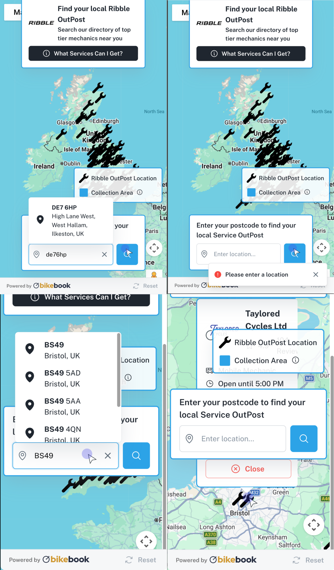
Four-panel image showing a map of the UK and Ireland with multiple wrench icons marking Ribble OutPost locations. The top-left panel shows a search input with the postcode 'de76hp' entered and a location popup displaying 'DE7 6HP, High Lane West, West Hallam, Ilkeston, UK.' The top-right panel shows an empty search input with an error message 'Please enter a location.' The bottom-left panel shows a search input with 'BS49' typed and a dropdown with multiple Bristol area postcodes. The bottom-right panel shows a search input with 'Enter your postcode' placeholder, a popup for 'Taylored Cycles Ltd' marked on the map near Bristol, including service icons and hours until 5:00 PM, and a close button. Each panel includes branding and navigation elements at the bottom.
1
2
3
4

Brief and constraints

The widget had to work at every breakpoint inside an iframe, stay neutral enough for partner branding, and use existing calendar and payment components that I could not change. The design system barely existed, and the direction shifted midway from Bikebook’s existing style to a Shopify and SumUp look. The knife retailer needed different copy and customisable fields, because the software now serves businesses beyond bikes.

Assigning services to bikes

The original flow asked for a bike and then services, so one booking could not cover several bikes with different services. I reversed the order: choose services, add bikes, then assign each service to a bike. The order also suits the data. Not every mechanic can do every service, so the system can show only the mechanics and dates that can do the work, instead of a customer getting a phone call after booking.
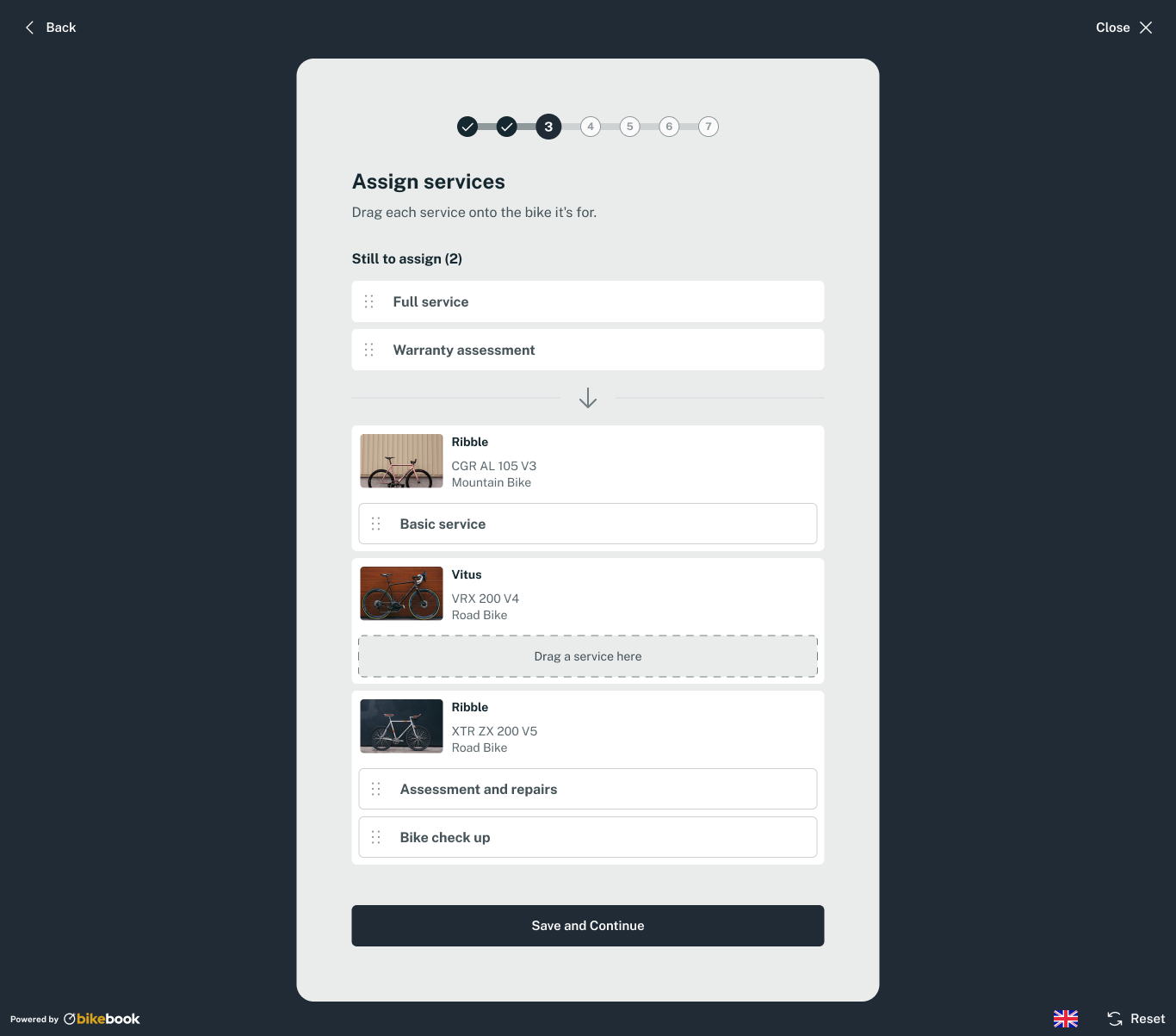
User interface screen showing a step in a service assignment process with a progress bar at step 3 of 7. The heading reads 'Assign services' with instructions to drag each service onto the associated bike. Two services, 'Full service' and 'Warranty assessment,' remain to be assigned. Below are three bikes: Ribble CGR AL 105 V3 Mountain Bike with 'Basic service' assigned; Vitus VRX 200 V4 Road Bike with an empty slot for dragging a service; Ribble XTR ZX 200 V5 Road Bike with 'Assessment and repairs' and 'Bike check up' assigned. Buttons for 'Back,' 'Close,' and 'Save and Continue' are visible, along with icons for language selection and reset.

Drag and drop onto bike cards

Visual, but difficult on mobile phones, hard to make accessible, and it left out prices.
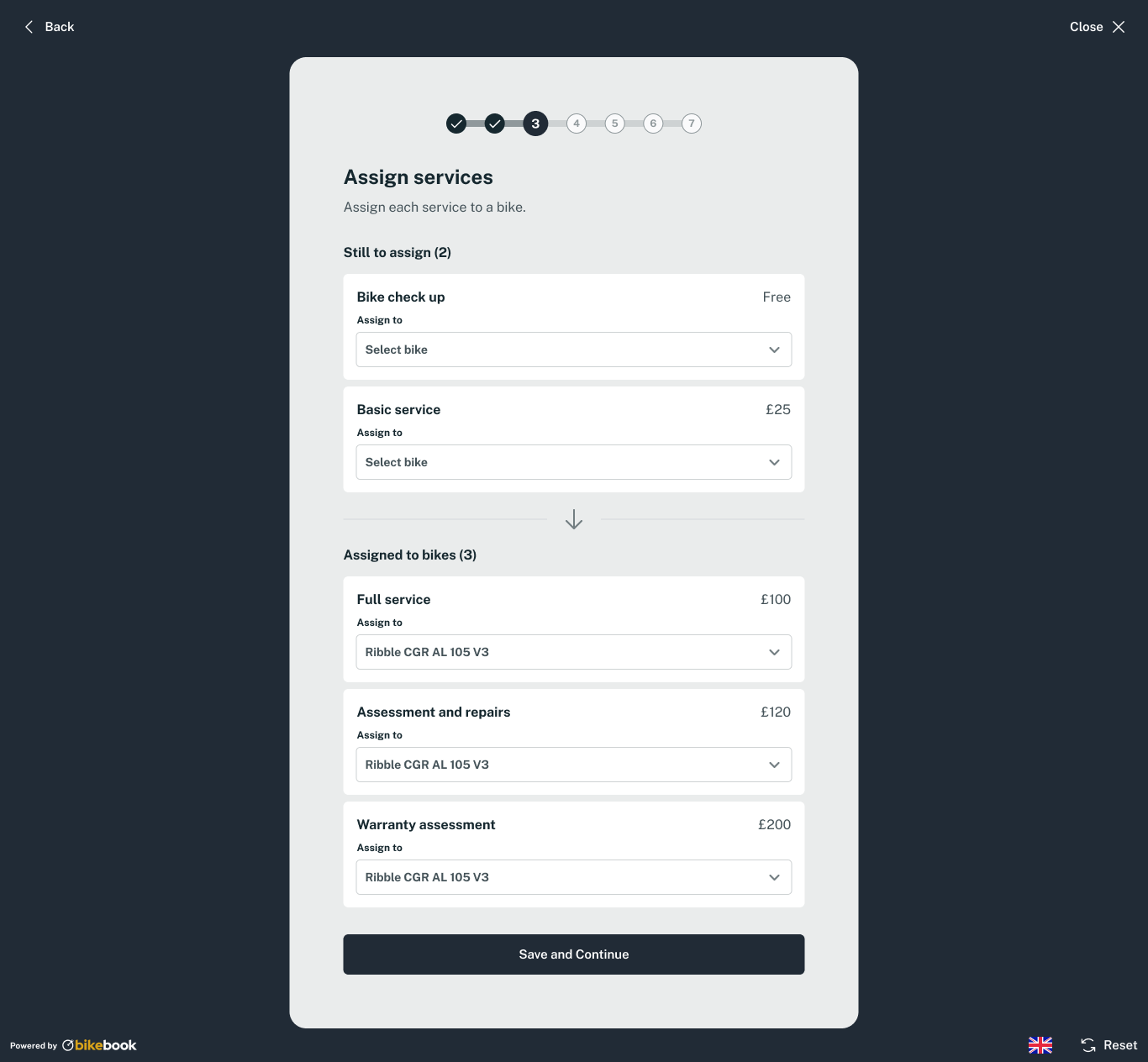
User interface screen titled 'Assign services' with steps progress bar highlighting step 3. Two unassigned services: Bike check up (Free) and Basic service (£25) with dropdown menus labeled 'Select bike'. Three assigned services: Full service (£100), Assessment and repairs (£120), and Warranty assessment (£200) all assigned to 'Ribble CGR AL 105 V3'. A downward arrow separates unassigned and assigned sections. A 'Save and Continue' button is at the bottom. Navigation options 'Back' and 'Close' are at top corners.

Dropdowns in two sections ("Still to assign" and "Assigned to bikes")

Familiar, with prices visible, but it takes more space and moves services between sections.
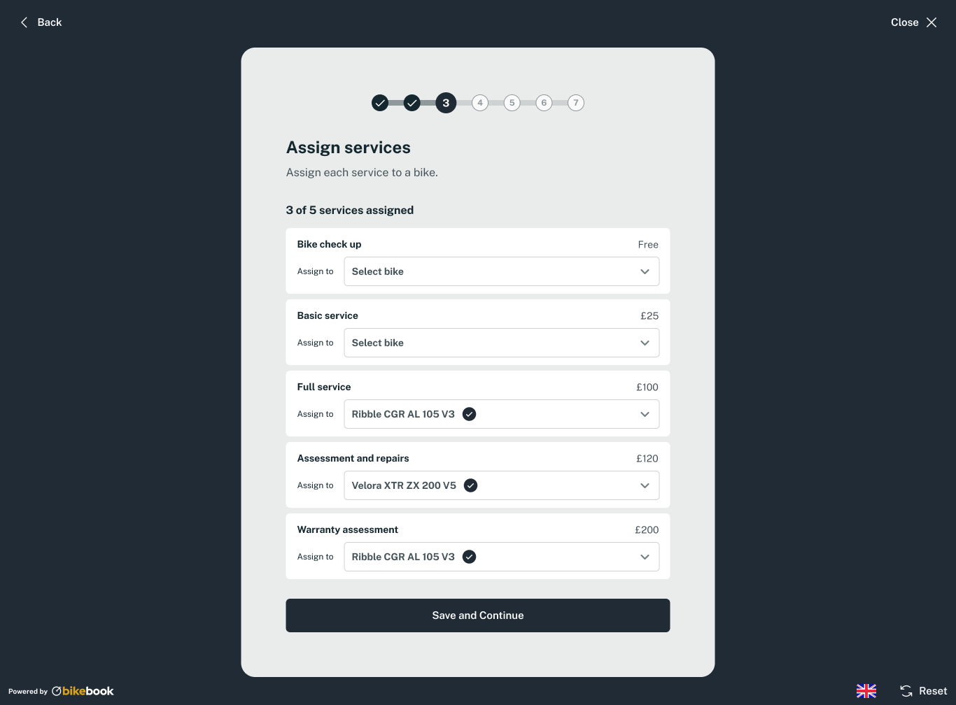
User interface screen titled 'Assign services' showing step 3 of 7 in a process. It lists five bike services—Bike check up (free), Basic service (£25), Full service (£100), Assessment and repairs (£120), and Warranty assessment (£200)—with dropdown menus to assign each to a bike. Three services are assigned: Full service and Warranty assessment to 'Ribble CGR AL 105 V3' and Assessment and repairs to 'Velora XTR ZX 200 V5'. Buttons labeled 'Back', 'Close', and 'Save and Continue' are visible, along with language and reset options at the bottom.

Chosen

One list with a dropdown on each service, a running count and a tick

I chose the single list on accessibility, ease of use and use of space, after trying the options myself and with colleagues and partners. If services are left unassigned, a dialog offers to go back or continue without them.

Your details, sign-in and guest booking

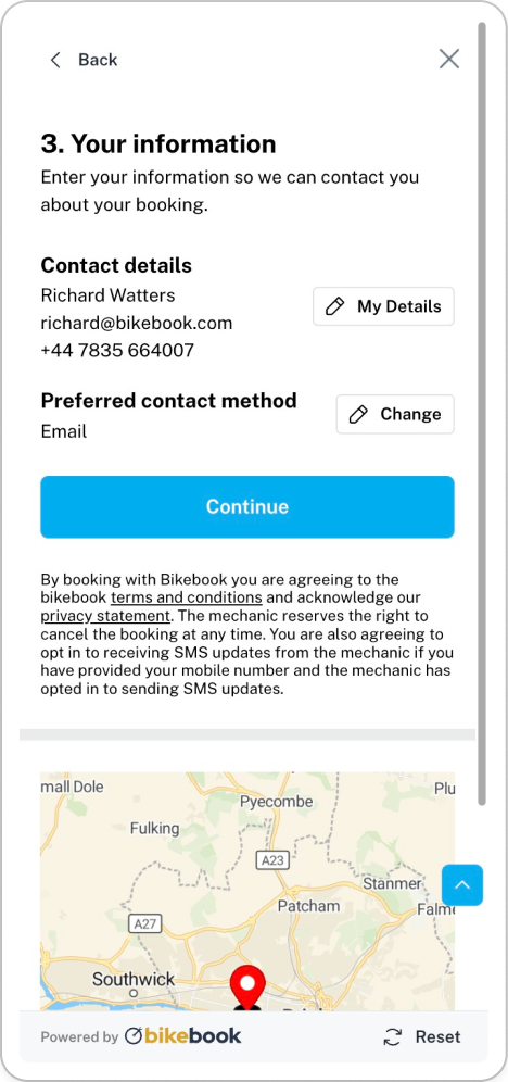
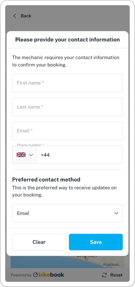
This step lost 52.5% of people. It came near the end, required both an email address and a mobile number even after the customer chose a contact method, and carried seven lines of small-print terms.

  • Earlier in the flow. My hypothesis was that people who have started are more likely to carry on, and partners can follow up if they leave. One partner described the ideal as a classic Shopify checkout that starts with an email address.

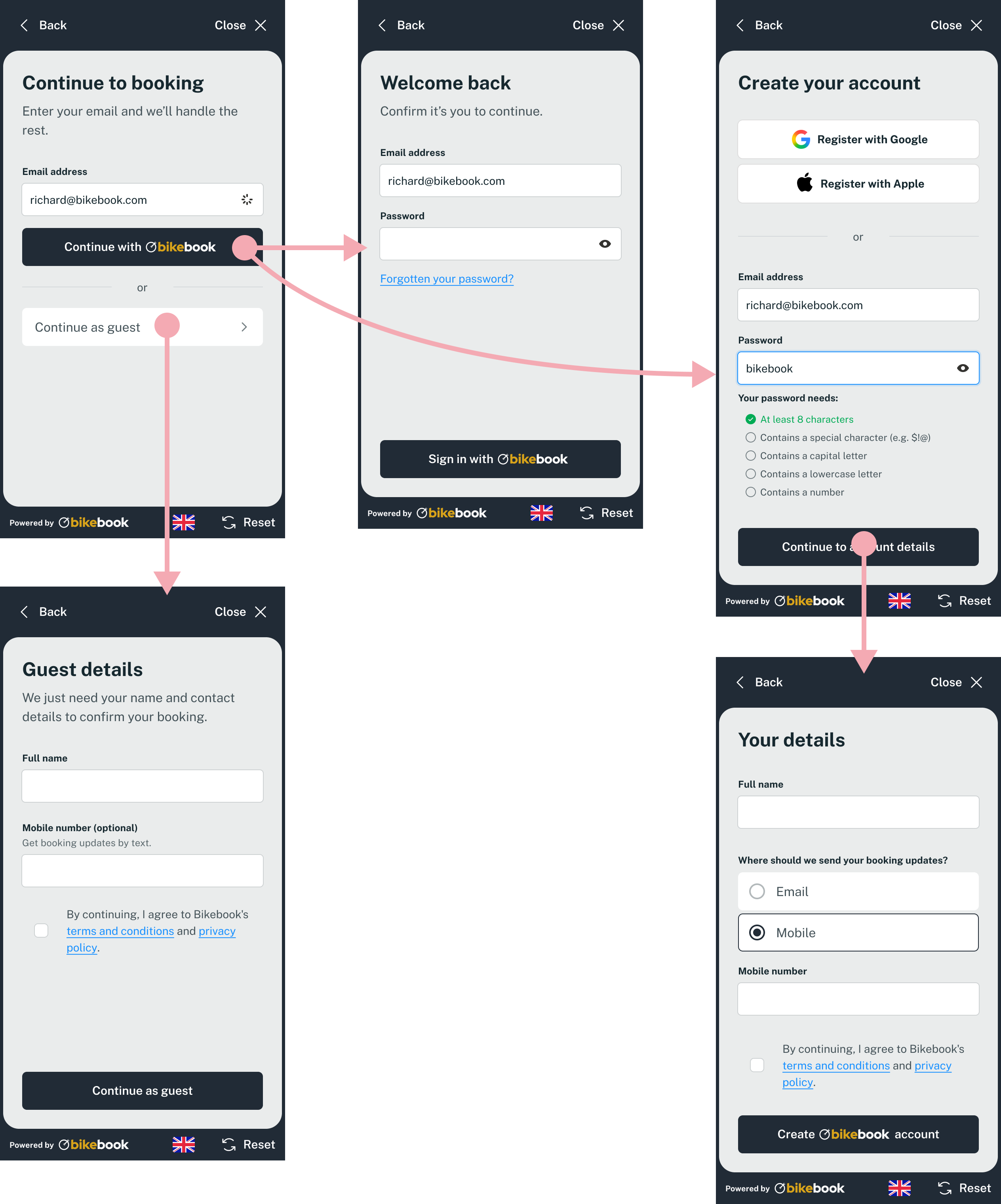
  • One field to start. The customer enters an email address. A returning customer sees "Welcome back", a new customer creates an account with Google, Apple or a password, and anyone can choose "Continue as guest", which did not exist before.

  • Only what is needed. The customer gives only the contact detail they chose, and the terms are one line with links.

Where single sign-on sat was debated. I proposed putting the Google and Apple options on the first screen. The co-founder leading development argued for email first, with "Continue with Bikebook" as the main action, to ease returning customers' journeys and build recognition as a login brand. We designed it that way, and the same label settled a debate about calling it a partner account
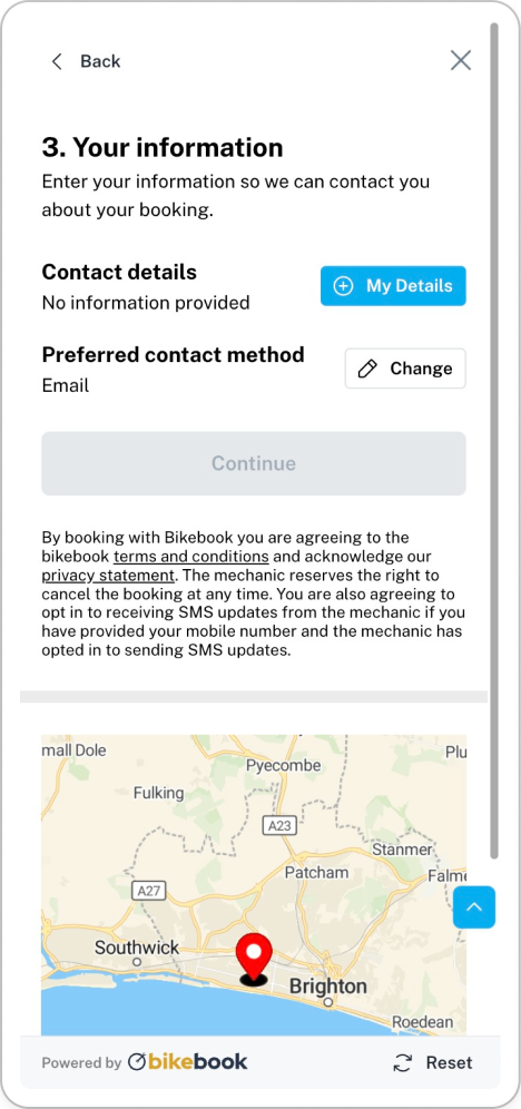
Booking form section titled '3. Your information' prompting user to enter contact details for booking. Contact details show 'No information provided' with a blue 'My Details' button. Preferred contact method set to Email with a 'Change' button. Continue button is disabled. Text explains agreement to Bikebook terms, privacy, and SMS updates. Below a map highlights Brighton with a red location marker near the coast. Options to reset the map appear at bottom right.
Mobile screen showing a form titled 'Please provide your contact information' with fields for first name, last name, email, and phone number including UK country code. Below is a dropdown for preferred contact method defaulted to email, and two buttons labeled 'Clear' and 'Save'. The form note explains the mechanic requires contact info to confirm booking and the preferred contact method receives booking updates. The screen background partially shows a map and branding 'Powered by bikebook'.
Mobile interface screen titled '3. Your information' asking for contact details for booking. Shows name Richard Watters, email richard@bikebook.com, phone +44 7835 664007, preferred contact method Email. Buttons labeled 'My Details' and 'Change' are visible, with a large blue 'Continue' button. Text explains booking terms, conditions, privacy statement, cancellation rights, and SMS updates. Partial map snippet with a red location marker labeled 'Powered by bikebook' and 'Reset' button below.
Five mobile app screens showing the Bikebook booking flow: 1) Continue booking screen with email input and buttons to continue with Bikebook or as guest; 2) Welcome back login screen with email and password fields, and sign-in button; 3) Create account screen with options to register with Google or Apple, email and password inputs, password criteria checklist, and continue button; 4) Guest details screen requesting full name and optional mobile number with consent checkbox and continue button; 5) Your details screen with full name input, booking update preference (email or mobile), mobile number input, consent checkbox, and create account button.

A design system built for white-labelling

I built components, tokens and a monochrome palette in a Figma library so the widget works with most brand colours. Partners change only the buttons and progress bar, and body copy stays fixed to keep contrast high. Figma variables let me re-brand a whole prototype for several partners without breaking the file. Engineering confirmed that a tool turning one or two brand colours into an accessible palette was feasible, but it was not yet built. Main calls to action buttons are at least 48px high, and body text is at least 16px.
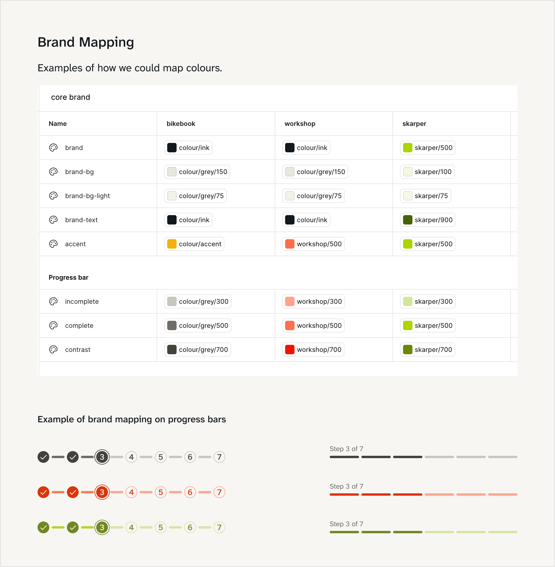
A brand mapping chart showing three core brands: bikebook, workshop, and skarper. The chart is divided into two sections: 'core brand' colors and 'progress bar' colors. For each brand, color swatches illustrate specific color names and shades used, such as black for 'colour/ink,' various greys for backgrounds, and distinct accent colors: yellow for bikebook, coral for workshop, and bright lime green for skarper. Below the chart are examples of progress bars with numbered steps from 1 to 7, styled in each brand's colors, highlighting step 3 in darker hues consistent with the brand palettes.

Try my coded prototype

I built it with Figma, Ship Studio, Claude Code and Vercel.

How I worked

I built the Figma file stage by stage, combined the stages into three versions of the whole flow, and adapted them for each partner, ending with a "Ready for Dev" page. Co-founders, developers and partners saw prototypes at every stage, and I asked them to vote on options and explain why. I checked constraints with engineers early, wrote the product Linear tickets and prioritised with the co-founders.

Evidence and how to measure it

I left before the design was built, so I have no post-launch data. What I do have is the baseline above, feedback from partners who reviewed the prototypes (they described it as a clear improvement) and engineering input on feasibility.

Once it is live, I would measure:

  • Reducing drop-off at the postcode (82.9%) and details (52.5%) steps.

  • Increasing overall completion (under 5%).

  • Reducing time on the page (time to complete the booking flow).

  • Customer lead capture, which I expect to rise because details are now requested at the start

  • Session replays, for fewer errors and overlay problems

  • User testing feedback.

  • Partner feedback.

Reflection

  • Agree the brief first. Requirements were scattered across historical Linear documents and some arrived very late into the project.

  • Settle the visual direction early. The midway shift to a Shopify and SumUp look meant reworking components. Tokens made that manageable.

  • Phase the release. Ship the postcode step first and measure it. It was the biggest drop-off, so improving it is likely to have the biggest impact.

  • Add edit links to the review step, so customers do not have to go back through the stepper.

Listening to partners shaped my priorities more than anything else. Involving them in the project made them feel heard, and more likely to support the change when the new flow launched. The result is a consistent, logical flow that can be adapted for a new partner without redesigning it. The copy is written in plain language. I drafted options with AI tools and edited the final wording myself.
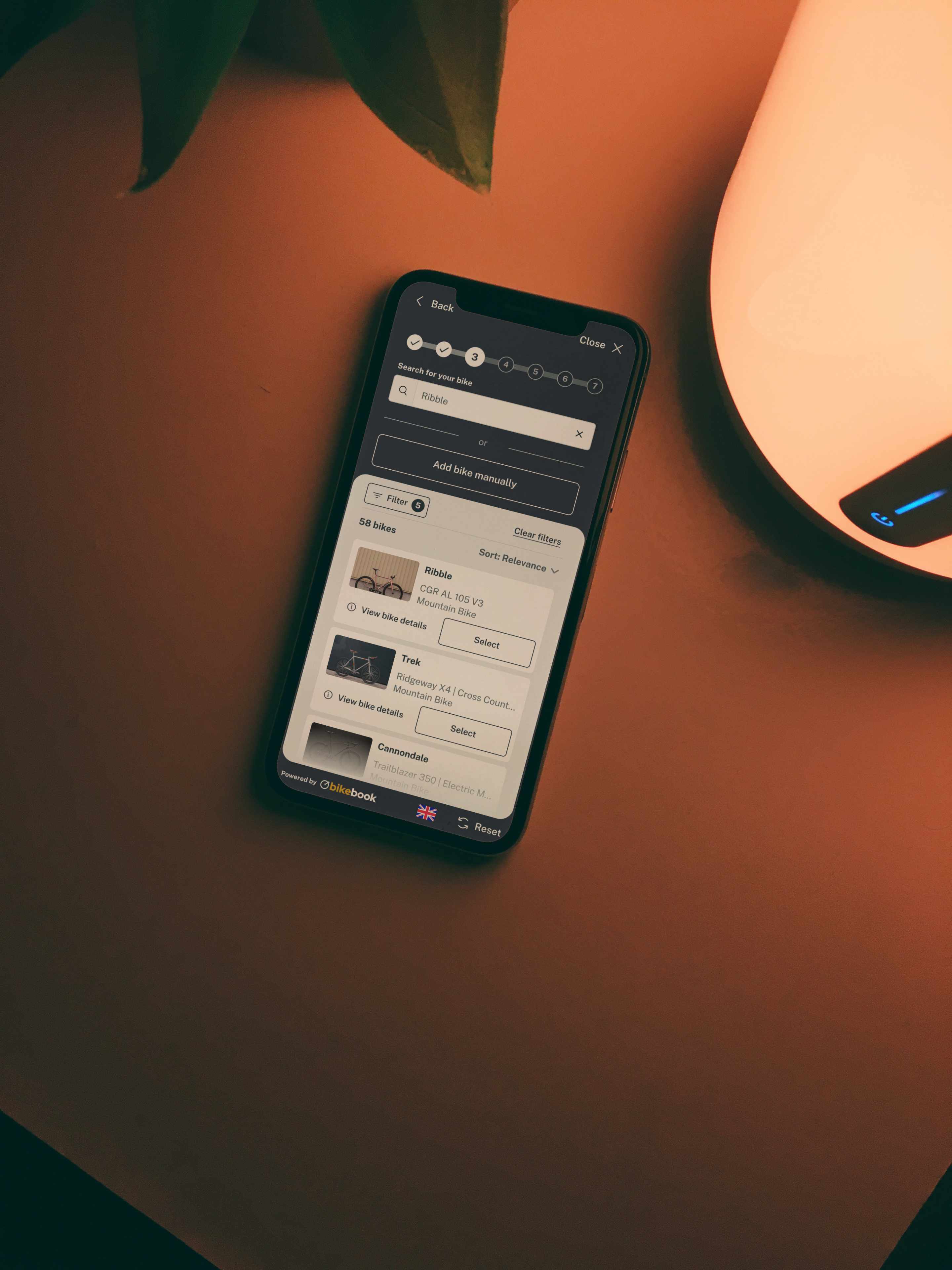
Smartphone on a table showing a bike search app with options like Ribble, Trek, and Cannondale, alongside a warm light source and a green leaf in the background.
Person wearing a green shirt and white t-shirt holding a smartphone in one hand and the handlebar of a bicycle with the other, standing on a paved surface.
Clean desk setup with a Dell monitor displaying a bike selection app, a potted snake plant, a glass jar with pens and scissors, a closed laptop with an orange external hard drive connected, and a keyboard in the foreground.